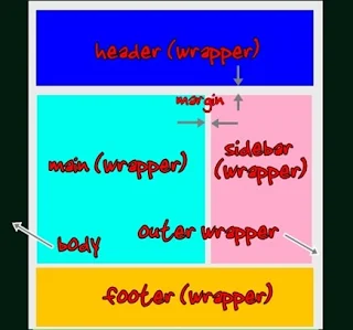
It's not hard to widen the display of your blog. There are 5 containers in a standard 2 column template, each with a separate width to change.
- Outer (contains, in turn, post and sidebar).
- Header.
- Post area ("Main").
- Sidebar.
- Footer.
With a "standard 3 column" template (left sidebar - main column - right sidebar), #3 Main will be divided into Left Main and Right Main, with one being a second sidebar, and the other being the posts column. A variation on the "standard 3 column" template puts the left and right sidebars next to each other, as you can see in my home blog, Nitecruzr Dot Net. In the latter case, the Post ("Main") column will float opposite the sidebar column, and the sidebar column will contain the left and right sidebars, each floating opposite each other.
You'll generally make Outer, Header, and Footer equal width, but you don't have to. It's OK to have the header wider or narrower than the post / sidebar areas. Do this discretely though, so you don't waste valuable screen space.
The Main and Sidebar containers are the trickiest - they sit beside each other, and both have padding and margin widths to consider. If you make the Outer container 800px wide, you can't make the posts ("Main") 550px, and the sidebar 250px. There is padding inside the Outer container, and there are margins outside both the Main and Sidebar containers, that you must allow for. Ignore margins and padding, and you will have a dropped sidebar or main area.
Not all blogs, using standard Blogger templates, can be easily resized - some blog decorations will provide a challenge. The Rounders, Scribe, Son Of Moto, Thisaway, and TicTac templates each use fixed width page elements, as container borders. You can supposedly get custom versions of these templates, that are resizable, or that come in additional preset widths, but as custom templates produced outside of Blogger, they have various disadvantages.
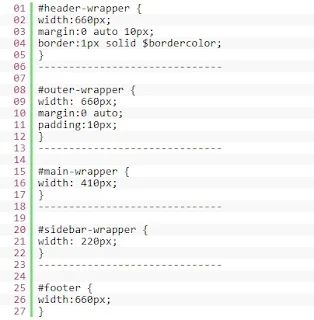
A blog that uses the Minima template, however, is easy to resize. This is from one of my blogs, which uses Minima. Note the naming conventions, which are standard for many resizable Blogger provided templates.
As always, I'll advise you to backup your template, before and after making these changes!
#header .description {
  margin:0 5px 5px;
  padding:0 20px 15px;
  max-width:700px;     <== #2
  text-transform:uppercase;
  letter-spacing:.2em;
  line-height: 1.4em;
  font: $descriptionfont;
  color: $descriptioncolor;
 }

/* Outer-Wrapper
------------------------------------------- */
#outer-wrapper {
  width: 670px;     <== #1
  margin:0 auto;
  padding:10px;
  text-align:left;
  font: $bodyfont;
  }

#main-wrapper {
  width: 420px;     <== #3
  float: left;
  word-wrap: break-word; /* fix for long text
breaking sidebar float in IE */
  }

#sidebar-wrapper {
  width: 220px;     <== #4
  float: right;
  word-wrap: break-word; /* fix for long text
breaking sidebar float in IE */

}

...

/* Footer
------------------------------------------- */
#footer {
  width:670px;     <== #5
  clear:both;
  margin:0 auto;
  padding-top:15px;
  line-height: 1.6em;
  text-transform:uppercase;
  letter-spacing:.1em;
  text-align: center;

}
Now, all of the discussion above describes a standard, old-fashioned fixed width template. I just migrated this blog to Layouts, and the Stretch Minima template. With Stretch Minima (and other dynamic / fluid templates), the blog fills the available horizontal space, automatically.
Check it out! Grab the sides of the browser window, and pull it in and out. Watch what happens as the browser gets narrower or wider.
/* Outer-Wrapper
----------------------------------------------- */
#outer-wrapper {
  margin:0;
  padding:10px;
  text-align:left;
  font: $bodyfont;
  }

#main-wrapper {
  margin-left: 1%; <==
  width: 67%; <==
  float: left;
  word-wrap: break-word; /* fix for long text breaking sidebar float in IE */
  overflow: hidden;     /* fix for long non-text content breaking IE sidebar float */
  }

html > body #main-wrapper {
  margin-left: 2%; <==
}

#sidebar-wrapper {
  margin-right: 1%; <==
  width: 25%; <==
  float: right;
  word-wrap: break-word; /* fix for long text breaking sidebar float in IE */
  overflow: hidden;     /* fix for long non-text content breaking IE sidebar float */
}

html > body #sidebar-wrapper {
  margin-right: 2%; <==
}
No more wasted space - the blog automatically fills whatever space the browser is given. All modern browsers should support this.
Blogger blogspot old template wraper


